Overview
Project Overview
Banco Falabella is one of the largest retail banks in Latin America, with operations in Chile, Peru, Colombia, and Mexico. In Chile alone, the bank serves millions of daily active users through its website and mobile platforms.
The home section of the app is a crucial entry point, used by customers to check balances, access products, and navigate banking services. However, the design had become outdated and cluttered, making it difficult for users to find information quickly and trust the experience.
Problem Statement
What was broken?
Although the app has high traffic, the home presented significant usability challenges:
- Overwhelming information density made navigation frustrating.
- Visual hierarchy did not guide users toward key tasks.
- The interface lacked a modern, consistent design aligned with user expectations and brand identity.
How might we redesign Banco Falabella's homepage to make it more intuitive, modern, and trustworthy — while supporting millions of customers with diverse needs?
Research
Understanding the problem
To understand the pain points and opportunities, I worked with the team to analyze:
- Analytics: High drop-off rates on key areas of the home with heatmaps and Google Analytics.
- User feedback: Customers reported difficulty finding loan details and card management.
- Benchmarking: Compared Falabella's home with leading global banks and fintechs to identify gaps in usability and trust signals.
Heatmaps
User Interviews
Benchmarking
Google Analytics
Key Insights
What users really needed
- Users wanted quick access to daily tasks — balances, card payments, and transfers.
- The old design had too much marketing content competing with functional needs.
- Old design was not aligned with the minimalistic brand style and wasn't consistent with the website, which confused users.
Ideation
Exploring directions
Based on insights, I sketched multiple directions:
- A task-oriented home prioritizing user actions above everything else.
- A modular design system for flexibility and scalability across regions.
- A clear visual hierarchy where key services were easy to find at a glance.
We aligned with stakeholders on a design direction that balanced business needs (highlighting products) with user needs (efficiency and clarity).
Design Process
From wireframes to real users
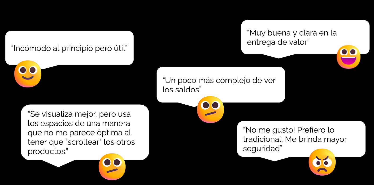
I moved from low-fidelity wireframes to high-fidelity mockups in Figma. These mockups were then tested with real users for usability and findability. We also conducted in-depth interviews.
- Users found it faster to complete daily tasks on the new homepage.
- The cleaner layout increased trust and reduced confusion significantly.
- Feedback confirmed the balance between function and promotion felt more natural.
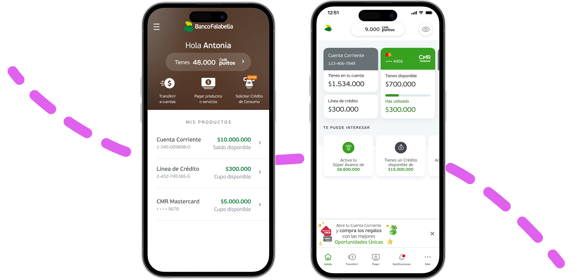
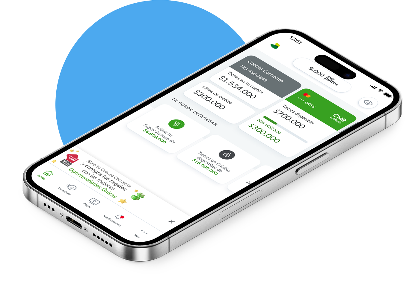
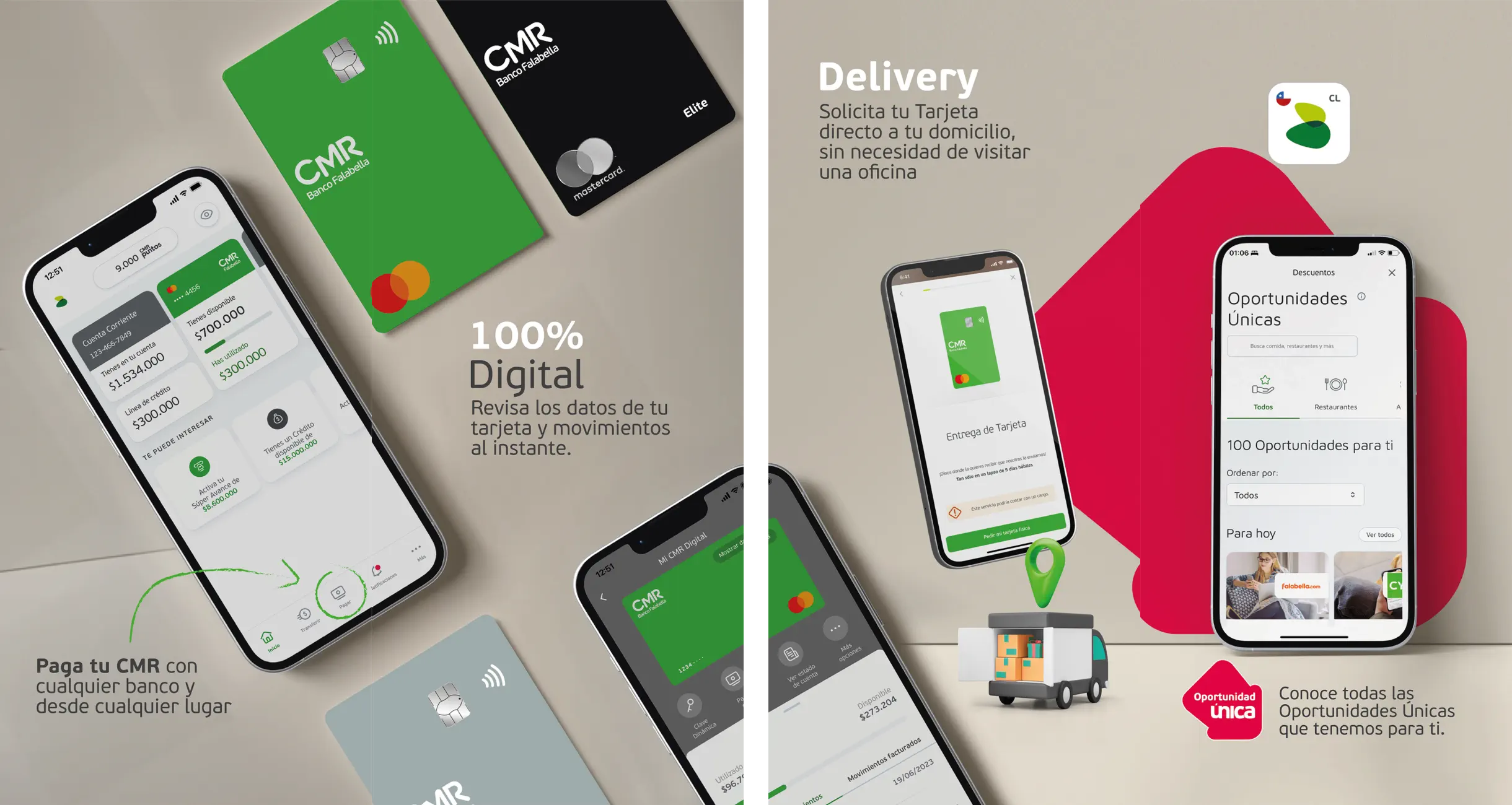
Final Solution
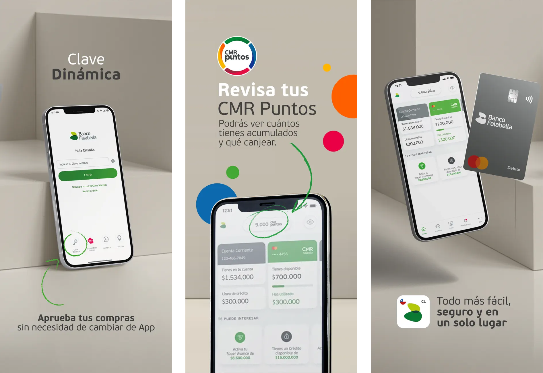
The redesigned homepage
- A modern, responsive interface aligned with current brand guidelines.
- Quick access modules for key actions — balances, transfers, and cards — front and center.
- A scalable card-based system adaptable across devices and Latin American markets.
Impact & Results
What we achieved
- Improved usability: Task completion times reduced significantly across core flows.
- Increased engagement: Users explored more services through the modular layout.
- Business alignment: The home effectively showcased financial products without overwhelming customers.
- Marketing impact: All promotions and ads relocated to a dedicated space that improved banner conversion and cross-sales.